


Active Topics
-
Porting apps to Leste (29)
to Maemo 7 / Leste by Arno_11 - 1 day, 10 hrs ago -
Install Fonts in N900 (68)
to Maemo 5 / Fremantle by teroyk - 2 days, 13 hrs ago - more...

| The Following 8 Users Say Thank You to olf For This Useful Post: | ||
 |

|
2019-03-20
, 14:18
|
|
Posts: 237 |
Thanked: 502 times |
Joined on May 2010
@ Mittelfranken, Germany
|
#532
|
Originally Posted by Fellfrosch

As you can see by my thanks, I have been following this thread closely. I planned to give my opinion at some time but wanted it to be qualified. I didn't fins time for that thou. I promise to sit down tonight to write up something decent.
@all it's quite sad, that there are so few people which give comments regarding design. I'm sure there are more people using pure maps and enjoy it, if an app looks good and professional. Some comments or ideas (also without drawn icons) would be very welcome.
| The Following 6 Users Say Thank You to Amboss For This Useful Post: | ||
 |
|
2019-03-20
, 14:50
|
|
Community Council |
Posts: 1,669 |
Thanked: 10,225 times |
Joined on Nov 2014
@ Lower Rhine
|
#533
|
Originally Posted by olf
Agreed, one reason for low participation seems to be that one would need to follow this thread very close as it was advancing quite fast.
But maybe I simply missed something, in this case my criticism would be, "A description how-to-vote was missing."
Originally Posted by Amboss
That would be great! Any suggestions and remarks are very welcome. I am collection all i did last week and will post somewhen this night, foremost to get the svgs out rinigus asked for.
I promise to sit down tonight to write up something decent.
__________________
Watch our weird watchfaces for mighty AsteroidOS
Performance comparison Video Sailfish 2.0 vs 1.1.9 vs 1.1.7
[MC eV] Maemo Community eV membership application please concider to join!
Watch our weird watchfaces for mighty AsteroidOS
Performance comparison Video Sailfish 2.0 vs 1.1.9 vs 1.1.7
[MC eV] Maemo Community eV membership application please concider to join!
| The Following 6 Users Say Thank You to mosen For This Useful Post: | ||
 |
|
2019-03-20
, 15:17
|
|
Posts: 1,092 |
Thanked: 4,995 times |
Joined on Dec 2009
@ beautiful cave
|
#534
|
Originally Posted by mosen
That's true! I hope my comment didn't sound harsh. It wasn't meant that way! It was more or less something like a deep-drawn sigh.
Agreed, one reason for low participation seems to be that one would need to follow this thread very close as it was advancing quite fast.
.

|
|
2019-03-20
, 17:14
|
|
Posts: 95 |
Thanked: 196 times |
Joined on Oct 2010
|
#535
|
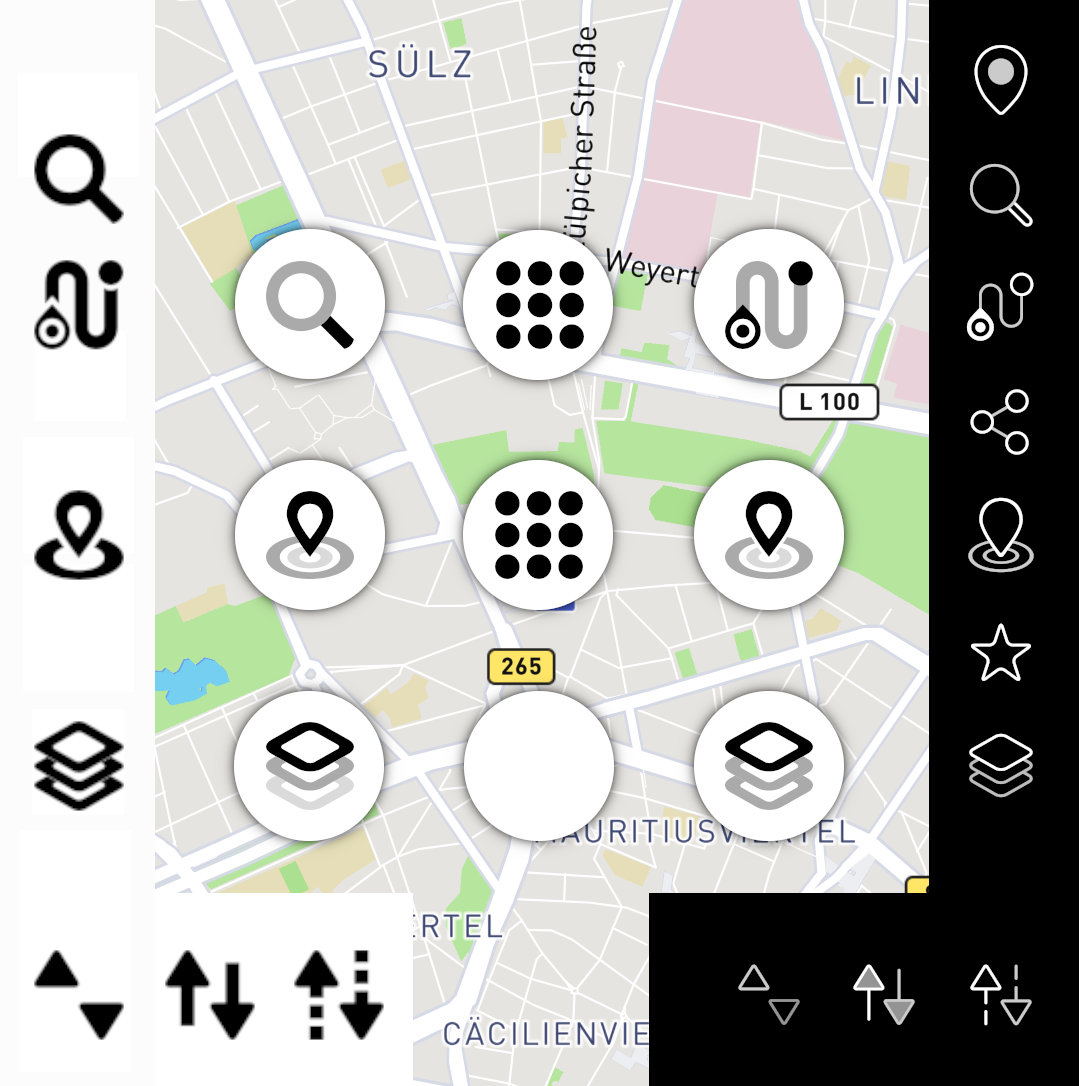
OK, so looking at this picture https://mosushi.de/misc/puremaps/overview8.jpg
I would also vote for "top left" as "search" icon.
"Nearby" I am undecided between bottom left and middle right.
"Navigate to" I like the icon on top right on that picture.
I would also vote for "top left" as "search" icon.
"Nearby" I am undecided between bottom left and middle right.
"Navigate to" I like the icon on top right on that picture.
| The Following 5 Users Say Thank You to Casanunda For This Useful Post: | ||
|
|
2019-03-20
, 17:32
|
|
Posts: 1,414 |
Thanked: 7,547 times |
Joined on Aug 2016
@ Estonia
|
#536
|
@olf: agreed, pooling station for votes would be great. And I have the same sentiments as @peterleinchen and respect to the great work done by @mosen and @Fellfrosch. Fortunately, they tend to agree 
we can probably setup some voting system as well when images are consolidated
we can probably setup some voting system as well when images are consolidated
| The Following 6 Users Say Thank You to rinigus For This Useful Post: | ||
|
|
2019-03-20
, 19:59
|
|
Community Council |
Posts: 1,669 |
Thanked: 10,225 times |
Joined on Nov 2014
@ Lower Rhine
|
#537
|
Kirigami
- search - now a little thicker. Please rinigus use it because i do not like the default gnome one

- nearby - epi center was the only thing i could draw with gnomish thick lines so for me the design is kind of fixed due to practicability
- maplayer - now with rounded corners to not look like a japanes pagode too much. EDIT Whoops, there are tiny spacings visible between the layer elements if you blow up the image. Those should not be there and are corrected in attached svg.
- profiles - is it possible to show the icon according to the currently selected profile? Then this would be my idea copied from sfos profiles (left to right - offline, online, mixed)
Sailfish
- nearby - same as with kirigami. Epi-center was kind of easy to transfer and due to limited time, thats what it is currently. EDIT, Also google search for "nearby icon" suggests it might be most standard and widely used(?)
- profiles - Did a variation of the current icon. Admitted, an easy cop out... I just could not find an idea that expresses profile "change" in one icon. So this depends on possibility to show icon according to current profile like kirigami version above
Map-View
- Search - I hereby decide ceremoniously, the search icon that was most mentioned shall be the winner.
The one with the reflection kind of was a test from my side if it might look good together with the other 3 transp. layer icons. nope. - nearby - left one is with circles touching the poi marker, right one has a spacing in between. I think i favour the left one because all other map-view icons are without spacing between elements
- maplayer - Left one has 3 transparancy levels and is my favourite, right one is more solid with 2 transp. levels.
__________________
Watch our weird watchfaces for mighty AsteroidOS
Performance comparison Video Sailfish 2.0 vs 1.1.9 vs 1.1.7
[MC eV] Maemo Community eV membership application please concider to join!
Watch our weird watchfaces for mighty AsteroidOS
Performance comparison Video Sailfish 2.0 vs 1.1.9 vs 1.1.7
[MC eV] Maemo Community eV membership application please concider to join!
Last edited by mosen; 2019-03-20 at 20:16.
| The Following 10 Users Say Thank You to mosen For This Useful Post: | ||
 |
|
2019-03-20
, 20:25
|
|
Posts: 304 |
Thanked: 1,246 times |
Joined on Aug 2015
|
#538
|
Originally Posted by rinigus
I remember having voted for some of PureMaps' GUI elements a long time ago on a web-page, which was linked in this thread. That was technically working well and gathered much more feedback than currently (IIRC ~ 30 people). Additionally each vote made a clear statement ("1 ... 5"), whereas written statements tend to be "I like A, but B is also nice ...".
@olf: agreed, pooling station for votes would be great.
But basically I just intended to denote that feedback might be scarce this time due to the undefined process how to provide it properly.
And I have the same sentiments as @peterleinchen and respect to the great work done by @mosen and @Fellfrosch. Fortunately, they tend to agree
| The Following 7 Users Say Thank You to olf For This Useful Post: | ||
|
|
2019-03-20
, 20:47
|
|
Community Council |
Posts: 1,669 |
Thanked: 10,225 times |
Joined on Nov 2014
@ Lower Rhine
|
#539
|
Originally Posted by olf
Yes, did that on my site with a php script i had laying around from decades ago
I remember having voted for some of PureMaps' GUI elements a long time ago on a web-page
Thanks for the warm words. The result was not quite overwhelming though and using this system for every draft i put out would have taken equal the amount of time i used to do them on top.Problem this time was the "flow".
When i learned one thing in opensource development it is the importance of momentum. I just did what i had fun to do and wanted to progress.
Regarding necessity to vote. I do not see that too much. We have healthy discussions and a competent maintainer who is keen to take decisions

If rinigus still needs a vote on something, i will set it up for him.
__________________
Watch our weird watchfaces for mighty AsteroidOS
Performance comparison Video Sailfish 2.0 vs 1.1.9 vs 1.1.7
[MC eV] Maemo Community eV membership application please concider to join!
Watch our weird watchfaces for mighty AsteroidOS
Performance comparison Video Sailfish 2.0 vs 1.1.9 vs 1.1.7
[MC eV] Maemo Community eV membership application please concider to join!
| The Following 7 Users Say Thank You to mosen For This Useful Post: | ||
|
|
2019-03-20
, 20:50
|
|
Posts: 304 |
Thanked: 1,246 times |
Joined on Aug 2015
|
#540
|
Originally Posted by mosen
These are all gorgeous, I simply vote "Yes to all".
Two ideas, one question:
- IMO the meaning of the "offline only" icons becomes clearer, if the triangles point to a bar ("barring / stopping it"), i.e. "▶|" rotated 90° to the left and right (or "↹" rotated by 90°).
- I do not comprehend, why the line width of the bubble in the "nearby" icons is not constant, but thicker at the top. But maybe this is meant to denote something, I simply fail to understand.
If there is no serious reason, IMO a constant line width looks better (as it is already the case for the SailfishOS menu "nearby" icon). - I assume the bubble in the "nearby" icons is lacking a dot in their centre, because the "nearby" search can be applied to any location on the map (i.e., not just ones own current location).
If so, that makes sense. If not, please add a dot in the bubble's centre.
Last edited by olf; 2019-03-20 at 21:04.
| The Following 5 Users Say Thank You to olf For This Useful Post: | ||
But as all posts with new icon suggestions contained multiple choices, one cannot "vote" per the "Thanks!"-function at TMO, but must write a comment describing in written text, which variant of icons appears to be the best to oneself.
This is impractical, IMO:
- It takes significantly more time to vote than just a few clicks.
- The "voting comments" would clutter the main discussion thread.
But maybe I simply missed something, in this case my criticism would be, "A description how-to-vote was missing."Last edited by olf; 2019-03-20 at 20:03.